Stationary Population Pyramid: Meaning and Examples
Understand a stationary or column-shaped population pyramid, why it does not prove zero growth, and how to distinguish visual balance from a stationary population.
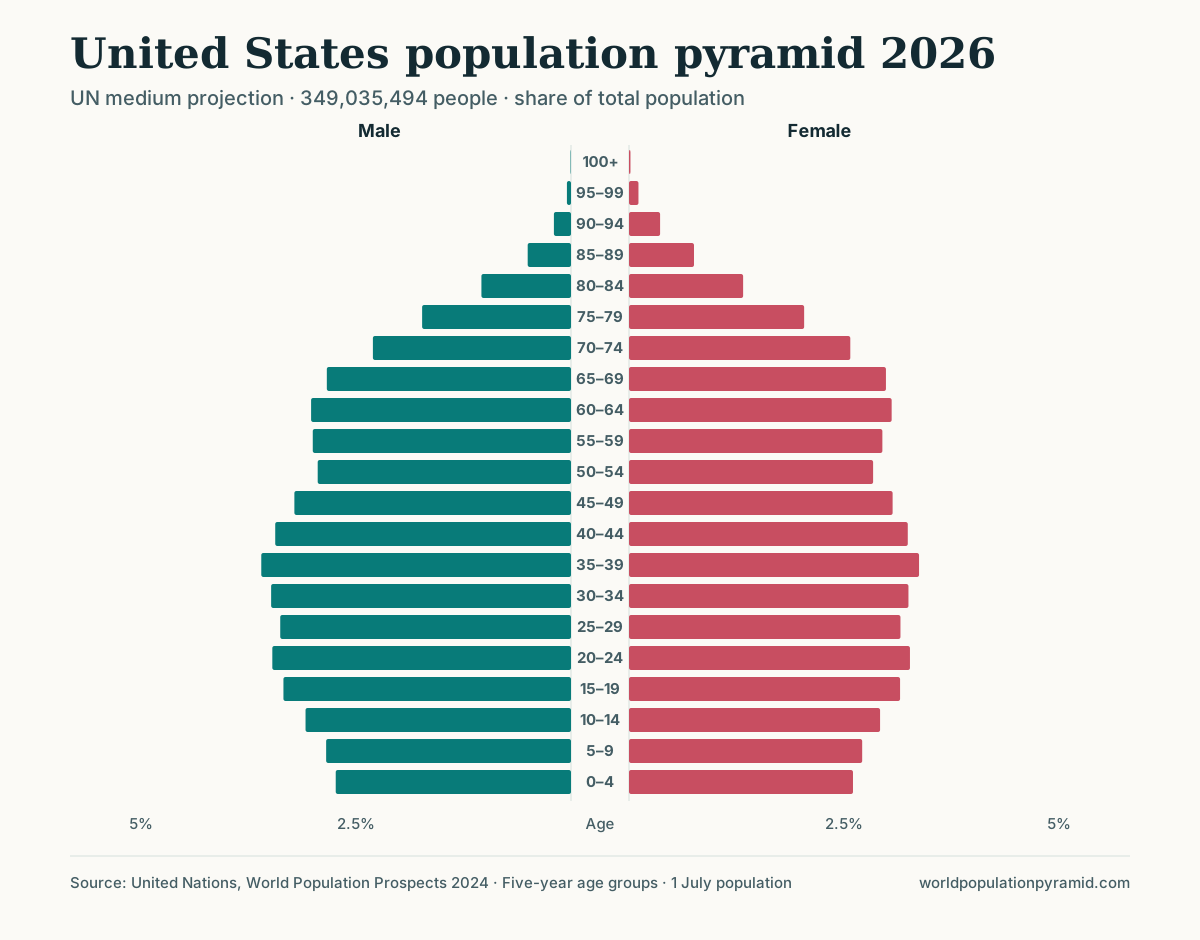
A stationary population pyramid has relatively similar cohort widths through much of the younger and middle ages. Its sides appear more vertical than a classic triangle, and it narrows mainly at older ages. “Column-shaped” or “bell-shaped” are sometimes used for related outlines.
The crucial warning is in the name: a stationary-looking pyramid does not prove a stationary population total. It describes the age distribution at one moment. Growth can continue because large cohorts are moving through reproductive ages, survival is improving, or migration is adding people.
Visual label versus formal demographic concept
Three different ideas are easily confused:
| Term | What it means |
|---|---|
| Stationary-shaped pyramid | An informal visual category with fairly even younger and middle cohorts |
| Stable population | A formal model in which constant age-specific fertility and mortality eventually produce a constant age distribution and constant growth rate |
| Stationary population | A special stable population with zero long-run growth |
Real national populations are open to migration, experience changing rates, and inherit irregular cohorts from past events. Most are therefore not formal stationary populations even when their charts look roughly columnar.
How to identify a stationary-looking structure
Look for a pattern rather than exact equality:
- several adjacent child, young-adult, and adult cohorts have similar shares;
- the base is neither dramatically wider nor dramatically narrower than the lower middle;
- there is no single uninterrupted decline from youngest to oldest;
- the chart tapers more clearly at older ages as mortality accumulates;
- child and older shares are more balanced than in an extremely youthful or aged structure, although they need not be equal.
The label becomes less useful when migration creates a sharp adult bulge, a baby boom creates one dominant cohort, or the base has recently narrowed rapidly.
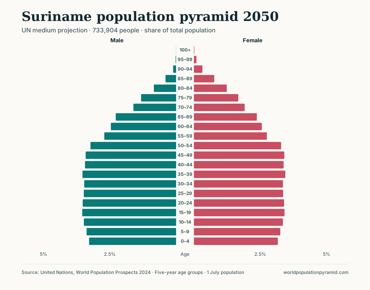
A close approximation appears in the UN projection for Suriname in 2050. Every five-year group from 0–4 through 50–54 holds between about 6.4% and 7.0% of the population, yet the projected growth rate that year is still positive, at 0.26%.
A useful example: India in 2026
India’s projected 2026 pyramid illustrates both the value and the danger of the stationary label. The five-year groups from ages 10 through 39 each account for approximately 7.8% to 8.7% of the population, producing a comparatively even lower-middle outline.
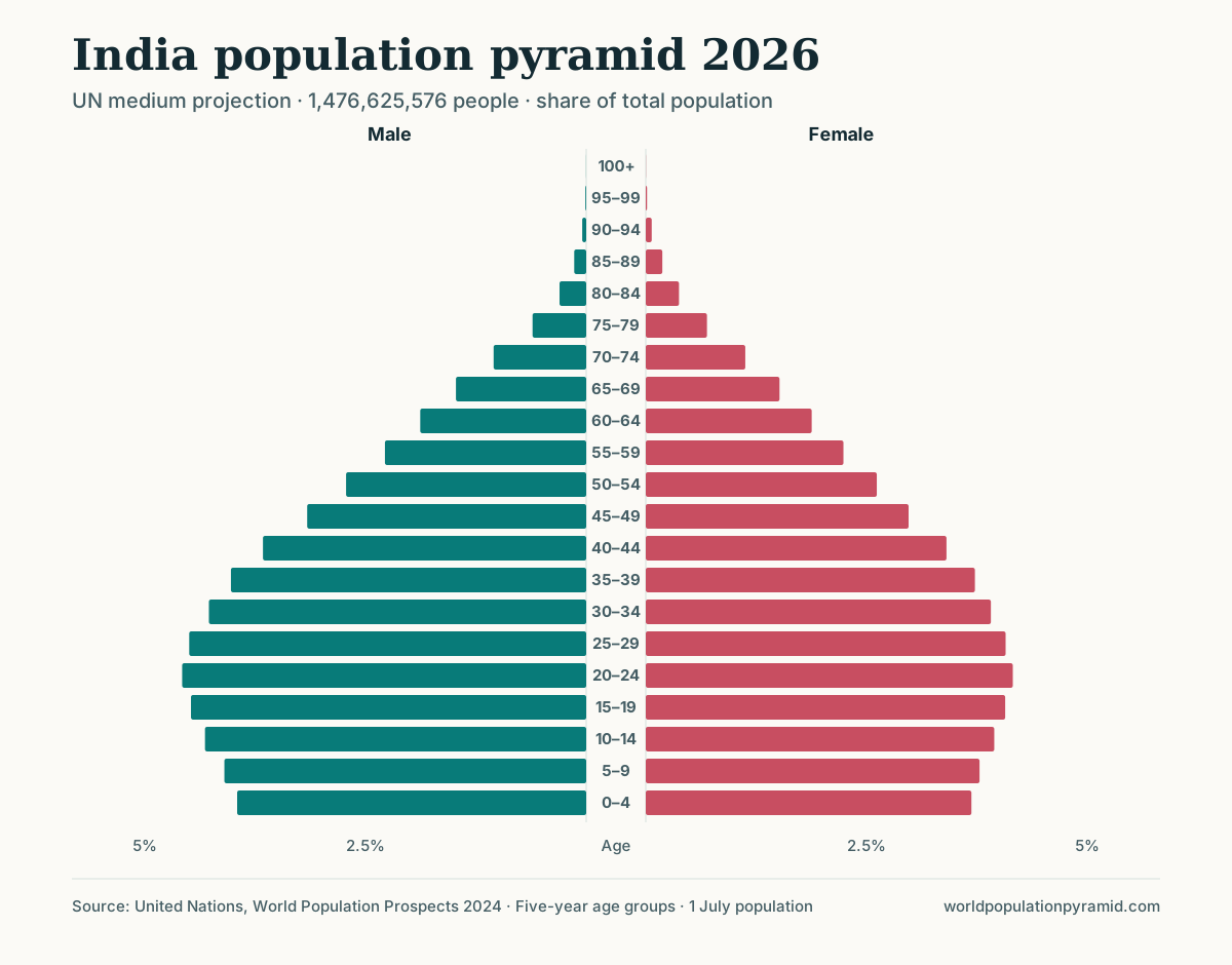
| Measure | India, 2026 |
|---|---|
| Population aged 0–14 | 23.8% |
| Population aged 15–64 | 68.6% |
| Population aged 65+ | 7.6% |
| Median age | 29.2 years |
| Total fertility rate | 1.93 births per woman |
| Annual population growth | 0.86% |
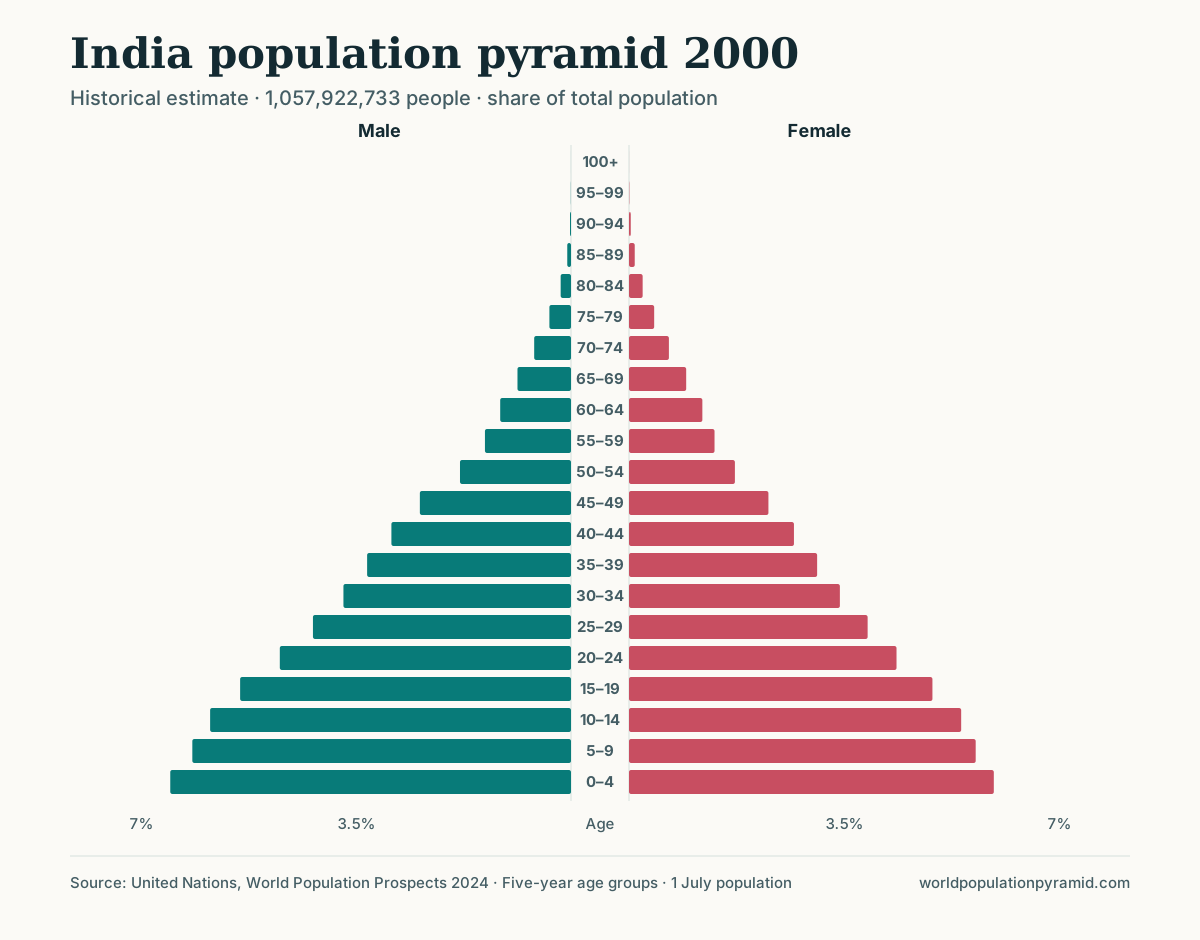
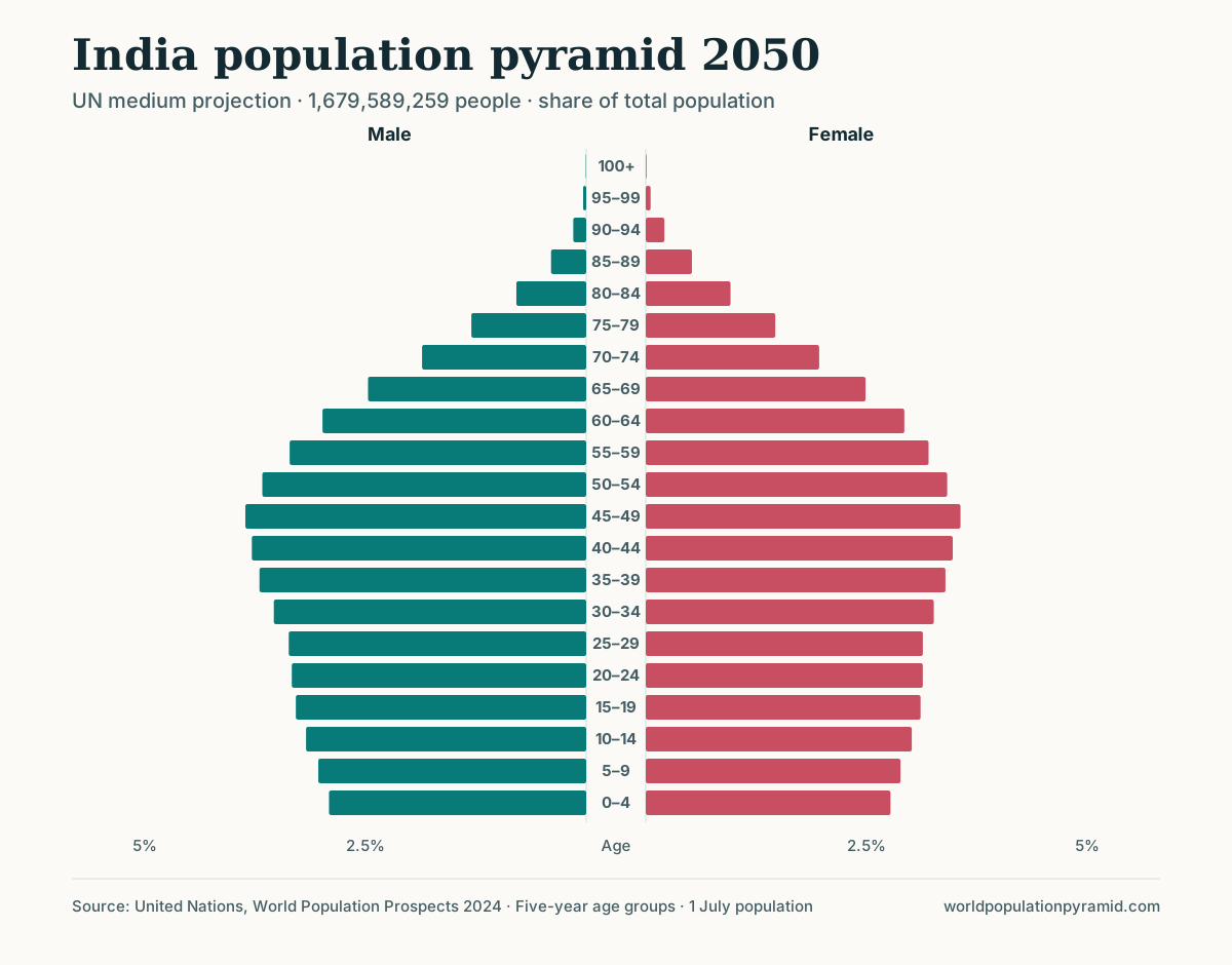
Open the India population pyramid and compare 2000, 2026, and 2050. The 2026 shape is much more column-like than a classic expansive triangle, yet population is still projected to grow. The youngest cohorts are also slightly smaller than the teenage and young-adult groups, indicating that the structure is changing rather than frozen.
India is not presented here as a perfect or permanent type. It is a measured example of why “roughly stationary-shaped” and “zero population growth” must be kept separate.
Why population can grow despite a column-like shape
Population momentum
If a previously expansive population contains many young adults (population momentum), births can remain numerous even after fertility falls. The average number of births per woman may be below the simplified replacement benchmark while the number of potential parents is large enough to sustain growth.
Improving survival
Longer survival adds people at older ages and can increase the total population even without large birth cohorts. The upper half becomes fuller gradually because changes accumulate as cohorts age.
Net migration
Migration can add working-age adults and their children. It can maintain total growth and alter the middle without producing the birth-and-death balance implied by the formal stationary-population model.
Timing
A single snapshot combines people born under many different demographic regimes. Today’s 60-year-olds reflect births and survival conditions six decades ago; today’s infants reflect current births and recent child survival. Similar bar widths do not mean those conditions were constant.
What a truly stationary population would require
In a simplified closed population, long-run stationarity requires births to replace deaths and no net migration, after the age structure has fully adjusted. Replacement-level fertility is not universally exactly 2.1: it varies with mortality and the sex ratio at birth. Even if replacement conditions begin today, an inherited young or old age distribution can produce years of growth or decline before the population settles.
This is why no single threshold—fertility of 2.1, growth near zero, or a rectangular chart—can independently establish stationarity.
Distinguishing stationary from expansive and constrictive
Use relative cohort widths:
- Expansive: child groups are consistently wider than the adult groups above them.
- Stationary-looking: many child and adult groups have broadly comparable widths.
- Constrictive: recent child groups are distinctly narrower than substantial middle-aged cohorts.
Real distributions lie on a continuum. A country may be stationary-looking through ages 10–40 but constrictive at the base. Another may have even cohorts overall but a migration-driven bulge on one sex’s side. The United States in 2026 is close to the first description.
Why percentages and counts tell different stories
A stationary-looking chart is usually easiest to see in percentages because every bar is expressed relative to the country’s total. Counts answer a different planning question.
Suppose every major age group grows by the same proportion. The percentage shape barely changes even though the number of people in every cohort rises. Conversely, a cohort can grow in number but shrink as a share if other groups grow faster.
Use percentages to compare structure across countries. Use counts to estimate the scale of schools, housing, employment, healthcare, or pensions. The counts versus percentages guide works through the calculations.
Common interpretation errors
“Births equal deaths”
The shape cannot establish annual vital-event balance. Check births, deaths, natural increase, migration, and the total growth rate.
“Fertility must be 2.1”
Current fertility influences only new cohorts directly. Every older bar records earlier conditions, and replacement fertility varies across mortality regimes.
“The economy is balanced”
Age structure does not measure employment, productivity, income, skills, unpaid care, or fiscal policy. A large working-age share creates a potential demographic window, not an automatic dividend.
“The shape will stay this way”
Cohorts move upward. If the current base is narrower than groups just above it, the apparent column may become constrictive as those cohorts age.
How to analyze a stationary-looking pyramid
- Compare the 0–14, 15–64, and 65+ shares.
- Identify the range over which cohort widths are genuinely similar.
- Check whether the 0–4 group is smaller than the 5–9 and 10–14 groups.
- Compare fertility with its historical trend, not only with 2.1.
- Check growth and migration before making claims about total population.
- Compare an estimate with the 2050 projection to see the direction of change.
The conclusion should describe the evidence: “The lower and middle cohorts are comparatively even, while the recent base is beginning to narrow.” That is stronger than saying simply, “This population is stationary.”
Sources and further reading
- United Nations World Population Prospects 2024 — data used for the India example.
- WPP 2024 methodology report — estimation and projection methods.
- U.S. Census Bureau: age profiles and population pyramids — distinction between chart size and age-sex shape.
- U.S. Census Bureau: median age does not tell the whole story — examples of different age structures sharing a median.
Frequently asked questions
What does a stationary population pyramid look like?
It has relatively similar widths across many younger and middle age groups, creating a column-like outline before narrowing at older ages.
Does a stationary pyramid mean the population is not growing?
No. Stationary is often used as a visual label. Population can grow because of momentum, longer survival, or migration even when the pyramid looks column-like.
Is a stationary population the same as a stable population?
No. In formal demography, stable population and stationary population have specific assumptions. A visually stationary pyramid is only a descriptive shape category.